Container query
A rule that responds to the size of the element's own container rather than the size of the window, which is what a component actually needs to know.
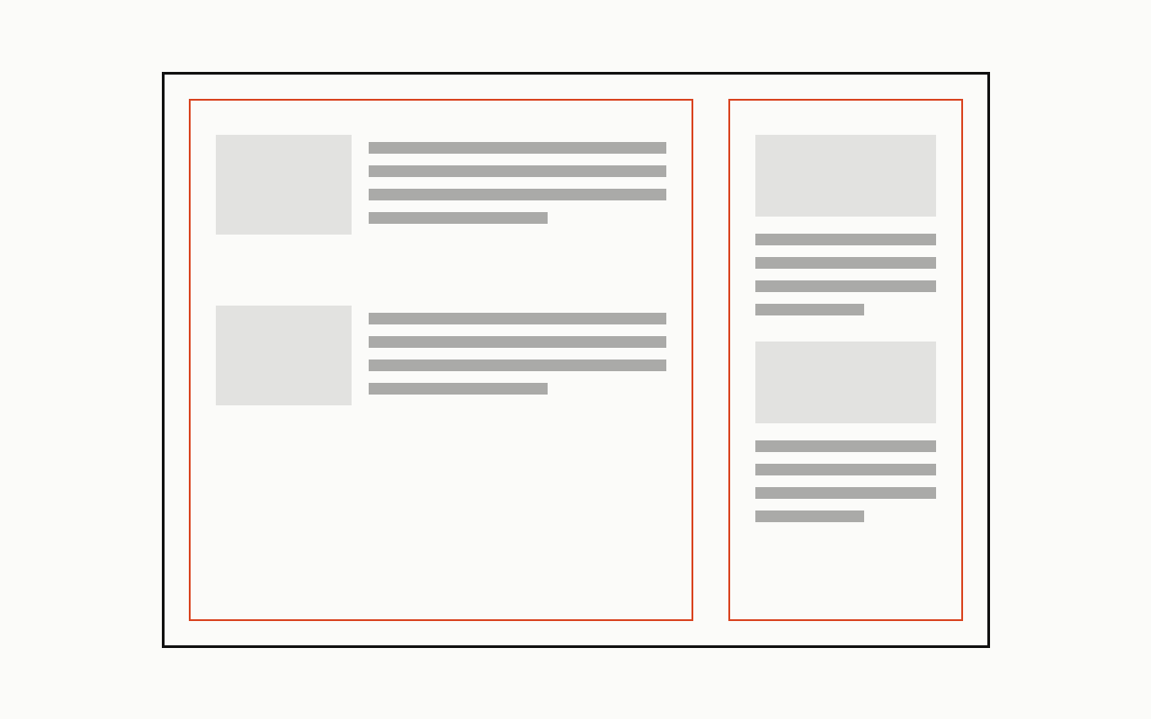
Near it
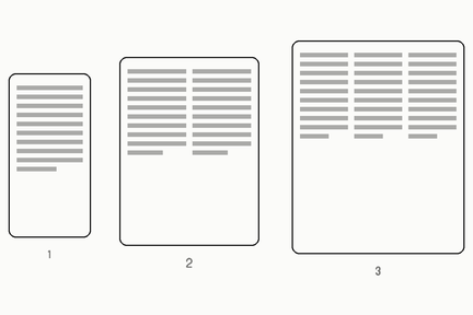 Responsive
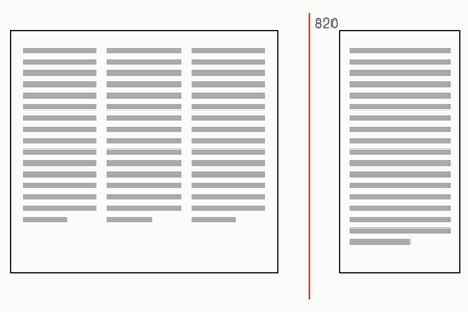 Breakpoint
What it is made of
| why it matters | an element asks how much room IT has, rather than how wide the window is, so the same component is right in a sidebar and in a full-width row | |
| measured on our own site | exactly ONE container query in the whole stylesheet: .card carries container-type:inline-size and its set name is sized at clamp(2.25rem, 42cqi, 5.5rem) | measured on ink.css, which is the whole of this site's CSS: one stylesheet, 95 rules, 2 media queries. One container against two viewport breakpoints is the honest state of it here: the site answers this question by SPACE twice and by CONTAINER once |