Breakpoint
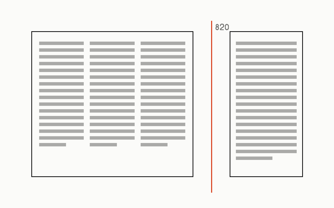
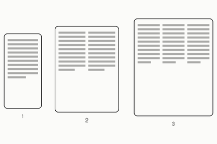
A width at which a layout changes shape, chosen from where the content stops working rather than from a list of device sizes.
Near it
 Responsive
 Fluid type
 Container query
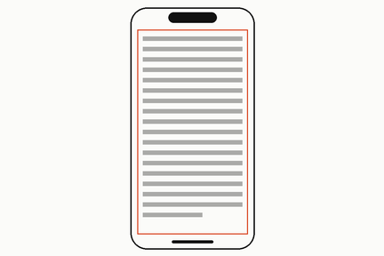 Safe area
What it is made of
| chosen badly | at a named device, so the layout is right on that phone and wrong on the next one | |
| chosen well | where the CONTENT breaks, found by narrowing the window until it does | |
| measured on our own site | there are 2 breakpoints in the whole of drewink.com, both max-width, at 34.1875rem and 43.1875rem, which is 547px and 691px | measured on ink.css, which is the whole of this site's CSS: one stylesheet, 95 rules, 2 media queries. Two is not a target and it is not a boast; it is what a site needs when the type is fluid, because a ramp that scales continuously has nothing to step at |
| and the larger of the two was bisected on 2026-09-11, which is how one is found | the first bisection returned 612px and was wrong: it asked whether the bar stayed one row and whether the page scrolled sideways, and both were true at 612 while one nav item sat on top of the wordmark | a nowrap flex item overflows its shrunken box in SILENCE, so neither question could see it. The test that held asked what was actually wanted: does every link clear the brand and the button by a real gap |